
Vue3项目中使用vw实现移动端适配
Sonder
2022-12-26
2812字
7分钟
浏览 (2.6k)
记录个人在Vue3项目中使用vw实现移动端适配,直接使用Vue官方提供的Vue-cli的构建工具来构建Vue项目。
首先需要全局安装Vue-cli:
npm install -g vue-cli安装完成后,就可以使用它来构建项目:
vue create vw-vant根据命令提示做相应的操作(以下是我个人的配置):
Vue CLI v3.11.0
┌───────────────────────────┐
│  Update available: 4.1.1  │
└───────────────────────────┘
? Please pick a preset: Manually select features
? Check the features needed for your project: Babel, Router, Vuex, CSS Pre-processors, Linter
? Use history mode for router? (Requires proper server setup for index fallback in production) Yes
? Pick a CSS pre-processor (PostCSS, Autoprefixer and CSS Modules are supported by default): Sass/SCSS (with node-sass)
? Pick a linter / formatter config: Standard
? Pick additional lint features: (Press <space> to select, <a> to toggle all, <i> to invert selection)Lint on save
? Where do you prefer placing config for Babel, PostCSS, ESLint, etc.? In package.json
? Save this as a preset for future projects? (y/N)
进入到刚创建的vw-vant:
cd vw-layout这时,可以看到的项目结构如下:
在vue-cli3中是没有.postcssrc.js和vue.config.js的,需要自己创建。
创建完成后需要安装以下插件
npm install postcss-import
npm install postcss-url
npm i postcss-aspect-ratio-mini postcss-px-to-viewport postcss-write-svg postcss-cssnext postcss-viewport-units cssnano --S
npm i cssnano-preset-advanced --save-dev
安装完成之后可以在package.json中查看是否安装成功。
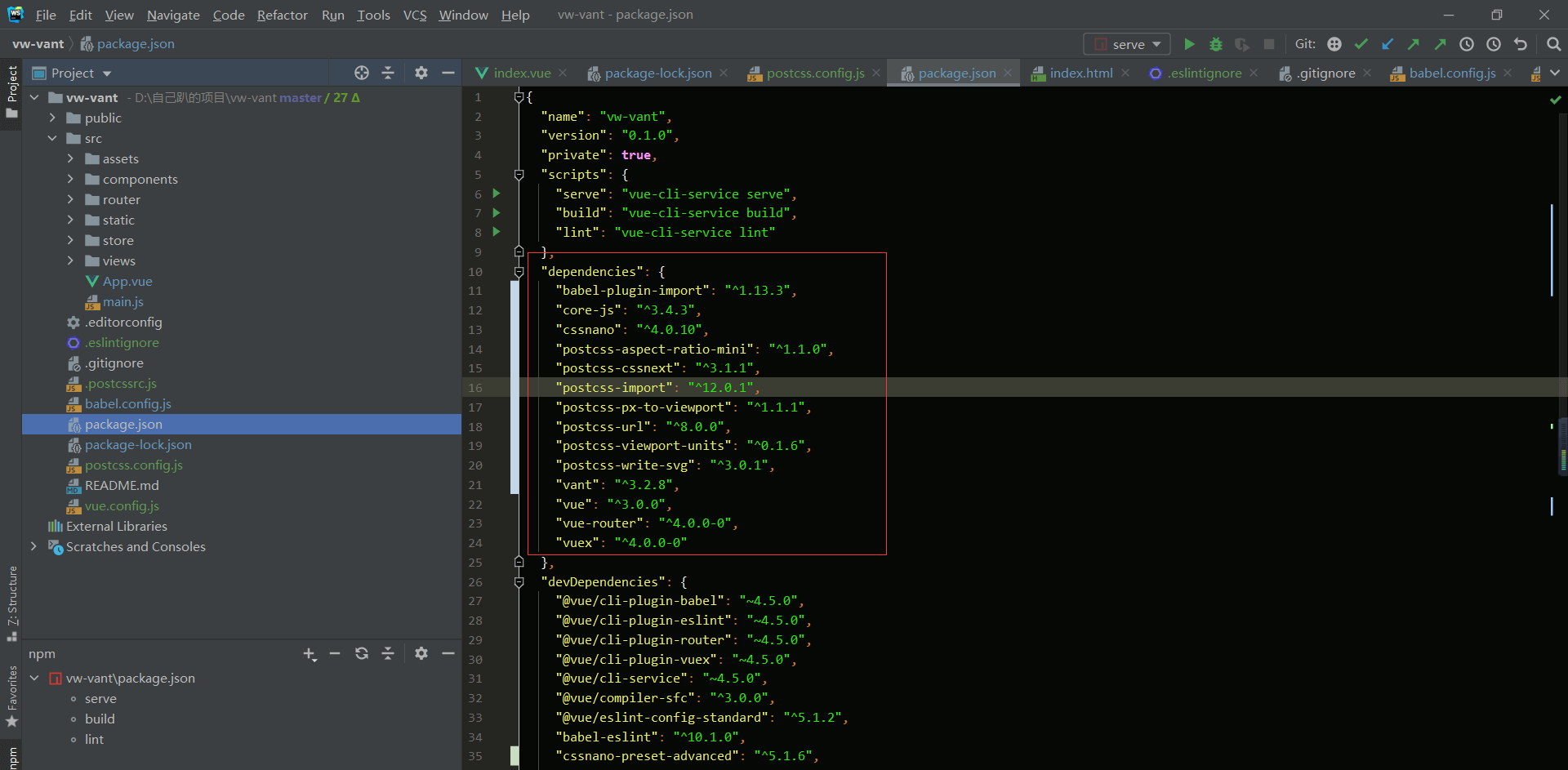
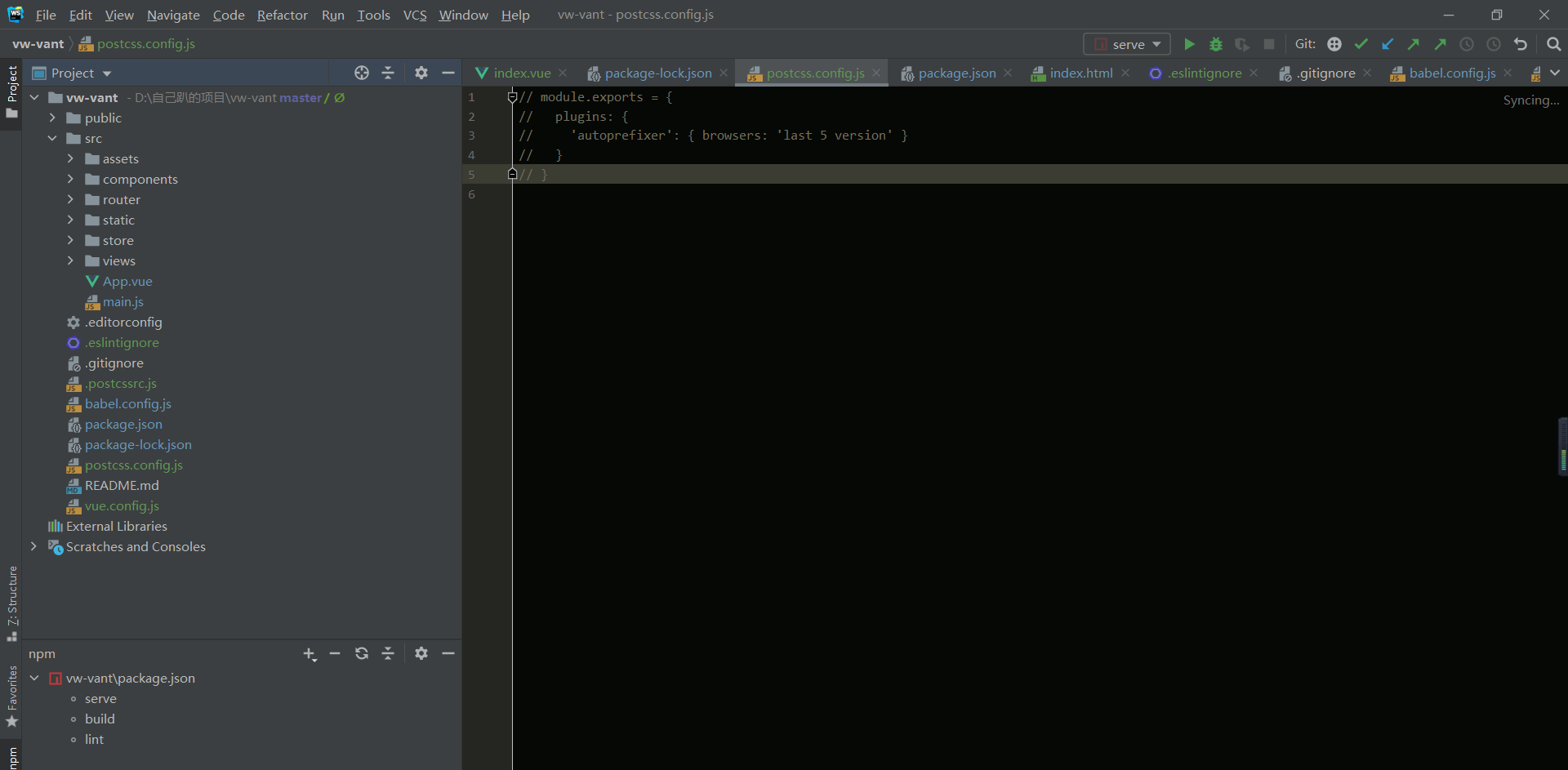
完整的.postcssrc.js代码如下:
module.exports = {
 plugins: {
   "postcss-import": {},
   autoprefixer: {},
   "postcss-url": {},
   "postcss-aspect-ratio-mini": {},
   "postcss-write-svg": {
     utf8: false
   },
   'postcss-px-to-viewport': {
     unitToConvert: "px",
     viewportWidth: 375, // 视窗的宽度,对应的是我们设计稿的宽度,一般是750
     viewportHeight: 812, // 视窗的高度,根据750设备的宽度来指定,一般指定1334,也可以不配置
     unitPrecision: 3, // 指定`px`转换为视窗单位值的小数位数(很多时候无法整除)
     viewportUnit: 'vw', // 指定需要转换成的视窗单位,建议使用vw
     fontViewportUnit: "vw",
     selectorBlackList: ['.ig-'],  // <div class="ig-aa"></div> 指定不转换为视窗单位的类,在该类型名下写不会转换为vw,可以无限添加,建议定义一至两个通用的类名
     minPixelValue: 1, // 小于或等于`1px`不转换为视窗单位,你也可以设置为你想要的值
     mediaQuery: false, // 允许在媒体查询中转换`px`
     replace: true,
     exclude: /(\/|\\)(node_modules)(\/|\\)/
   },
   'postcss-viewport-units': {
     filterRule: rule => rule.selector.includes('::after') && rule.selector.includes('::before')
   },
   "cssnano": {
     "cssnano-preset-advanced": {
       zindex: false,
       autoprefixer: false
     },
   }
 }
}
vw兼容方案
我这里使用viewport的polyfill:Viewport Units Buggyfill。
如何使用viewport-units-buggyfill?首先找到index.html,在页面中引入下面的代码完成了:
<script src="//g.alicdn.com/fdilab/lib3rd/viewport-units-buggyfill/0.6.2/??viewport-units-buggyfill.hacks.min.js,viewport-units-buggyfill.min.js"></script>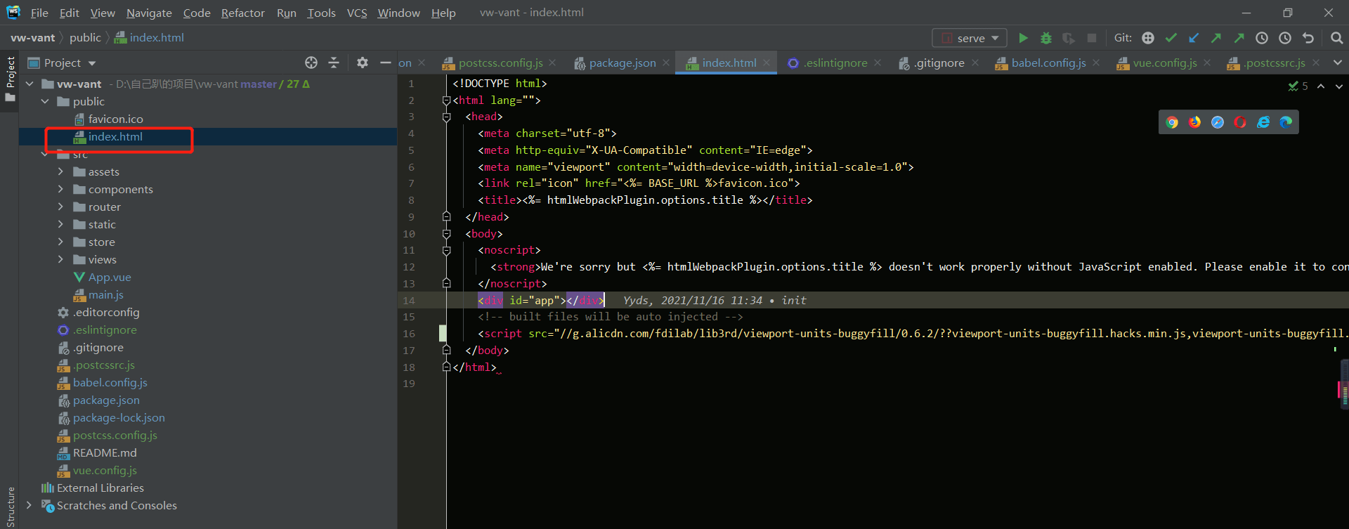
以上就是如何在Vue3项目中使用vw实现移动端适配方法,完结撒花